Quick answer: A Pareto by supplier and by category, price variance across sites, and a planned-versus-reactive split are among the highest-value charts in hard-services spend data. Each one only works once suppliers are normalised and spend is classified to the right depth. This piece covers nine charts worth building: what each answers, where it misleads, and the data it needs first.
On this page: The two Paretos · Tail-spend concentration · Price variance across sites · Planned vs reactive spend · Labour vs materials split · Spend per site · Subcontractor concentration · On-contract vs off-contract spend · Category spend trend vs index · What has to be true first · FAQ
Most facilities maintenance teams have more data than analysis. The finance system holds every invoice line, the CAFM system holds every work order, and between them sits the question a category lead actually has to answer this quarter: where is the money going, and which part of it can we do something about.
The chart is the cheap part. A Pareto takes ten minutes once the data is in shape. Getting it into shape — suppliers named consistently, lines classified deep enough to compare, units of measure that mean the same thing on every row — is the work.
Nine charts worth building from hard-services spend, and for each: the question it answers, the decision it unlocks, where it quietly lies to you, and the data it needs first.
1. The two Paretos: by supplier and by category
What it answers. How few suppliers account for most of the spend — and, on the same curve drawn over a different dimension, how few categories do.
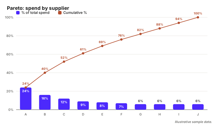
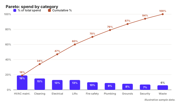
The value. They point at different actions. A concentrated supplier curve shows where leverage already exists and which contracts carry enough volume to justify reopening ahead of renewal. A concentrated category curve shows where to aim sourcing effort regardless of who supplies it today: if lifts are 13% of spend across eleven suppliers, the category is the opportunity and consolidation is the play.
Where it misleads. A supplier Pareto is meaningless while the same supplier appears under three names — legal entity, trading name and regional branch show up as three mid-sized suppliers instead of one large one, and the head of the curve is simply wrong. Normalisation comes before the chart, not after. The category version fails differently: at UNSPSC segment level everything collapses into three enormous bars that say nothing, and a large unclassified bucket sitting outside the chart makes it useless either way.
The data it needs. Normalised supplier names with a parent-child hierarchy so branches roll up to the group. For the category version, classification at UNSPSC family or class level — segment is too coarse to act on, commodity is more depth than this chart uses. Freight, fuel surcharges and call-out fees allocated to the line they belong to or shown as a visible slice; excluded, they understate landed cost and shift the ranking.
2. Tail-spend concentration
What it answers. How many suppliers make up the last few percent of spend.
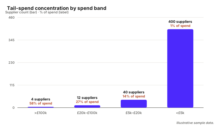
The value. The tail is process cost, not price. When 1% of spend sits across 400 suppliers the case is structural — a preferred list, a catalogue or a distributor arrangement that removes several hundred supplier records along with their onboarding, compliance and payment overhead.
Where it misleads. Duplicate records inflate the count directly, so an unnormalised ledger can show close to double the real number. It also mixes two problems: genuine one-off purchases, which only need to land somewhere sensible, and recurring small buys that should have been on a contract. Those get different responses, so the chart only helps once repeat suppliers can be separated by counting distinct invoice dates.
The data it needs. A deduplicated supplier master, spend per supplier over a fixed twelve-month window, invoice count and distinct transaction dates, and a flag for suppliers already on a framework. Family-level classification is enough here.
3. Price variance for the same item or task across sites
What it answers. For the same thing, what are we paying in different places.
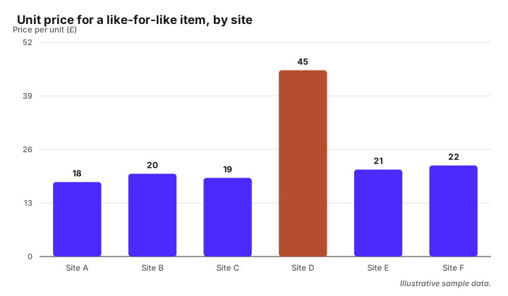
The value. The most directly actionable chart in the set. A 2.5x spread on a like-for-like item is a price problem, a specification problem or a routing problem, and each has an owner. It hands you the line to reopen a negotiation on and the evidence to hold a rate card to.
Where it misleads. A price-variance chart comparing different specifications is comparing nothing: two filter changes are not the same job if one is a panel filter and the other a bag filter, and a "lift service visit" ranges from a six-monthly inspection to a callout-inclusive contract. Units of measure do the same damage — a rate per box of ten against one per unit shows a 10x variance that does not exist. Access constraints and out-of-hours premiums also move price legitimately, and a chart that flattens them lets the supplier dismiss the analysis in the first meeting.
The data it needs. The deepest classification here: UNSPSC commodity level at minimum, usually with a manufacturer part number or normalised item description on top, because the commodity code will not separate two grades of the same consumable. Units of measure converted to one base unit. Quantity and unit price as separate fields, not a line total to divide. Site identifier, date, and a rate type distinguishing standard, out-of-hours and emergency labour.
4. Planned preventive maintenance versus reactive spend, over time
What it answers. Whether the balance between planned and reactive work is moving, and in which direction.
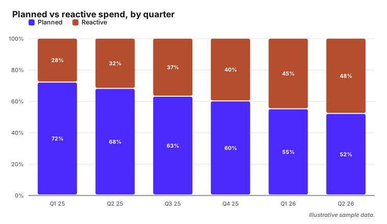
The value. The clearest financial argument for or against a maintenance regime. A reactive share climbing quarter on quarter in one asset group is the case for a PPM frequency change, an asset replacement, or a different scope at renewal.
Where it misleads. The split is only as good as the work-order coding behind it. Where engineers pick the priority field by habit, or a planned visit that becomes a repair stays coded as planned, the chart measures data-entry convention rather than maintenance reality. And a reactive share in currency moves whenever the planned contract value is rebased at renewal, so the line can fall with no change in behaviour.
The data it needs. Work orders with a reliable planned/reactive/corrective flag, joined to invoice lines so the chart is in money rather than job counts, plus a capital/revenue marker to keep replacements out. Asset group, site, and one consistent date basis — completion date and invoice date give two different charts, so pick one and say which. Where the CAFM flag is unreliable, classifying the invoice line text is often the better source of truth.
5. Labour versus materials split by category
What it answers. Of what we spend in this category, how much is people and how much is parts.
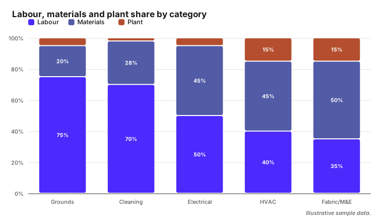
The value. It tells you which lever applies. A category that is 75% labour is a rates, productivity and scheduling conversation; one that is 45% materials is a specification and consolidation conversation.
Where it misleads. The split lives or dies on charge-line treatment. Where materials are marked up inside a composite job price, a materials-heavy category reads as labour-heavy, and a self-delivery model looks nothing like a subcontracted one for identical work. Call-out fees, van stock, plant hire and waste disposal each need a deliberate home; scattered across both buckets by accident, the ratio is noise.
The data it needs. Line-level invoices, not header totals — a lump-sum line cannot be split, and categories priced mostly as lump sums belong outside the chart rather than inside it with a misleading split. A charge-type tag per line separating labour, materials, plant, subcontract, disposal and surcharge. Category at family or class level, site identifier, and a delivery-model flag so self-delivered and subcontracted work are not silently mixed.
6. Spend per asset or per square metre by site
What it answers. Normalised for size, which sites cost more to maintain than their peers.
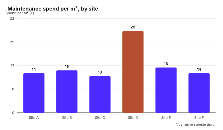
The value. An absolute spend-by-site chart only tells you which site is biggest; normalised, a genuine outlier appears and the follow-up is specific: a site review, a local arrangement nobody competed, plant at end of life, or a scope that includes something the others exclude.
Where it misleads. Per-square-metre comparisons need the sites to be genuinely comparable. A data hall, a workshop and an office are different maintenance propositions per square metre and always will be; ranking them together produces an outlier that is just the nature of the building. Gross internal area against net lettable area shifts every number by a fixed proportion, so a mixed basis makes the ranking meaningless — and a stale floor area, an extension built three years ago and never recorded, is wrong invisibly.
The data it needs. A consistent area measure on one stated basis, or an asset count with a known refresh date. Site or cost-centre identifiers that reconcile between finance and the property record — usually the hard part, because the two rarely use the same codes. A site-type classification so like is compared with like, and a full twelve months so seasonality does not decide the ranking.
7. Subcontractor concentration and single-source exposure
What it answers. Within each category, how much of the work sits with one subcontractor — and where a failure would hurt.
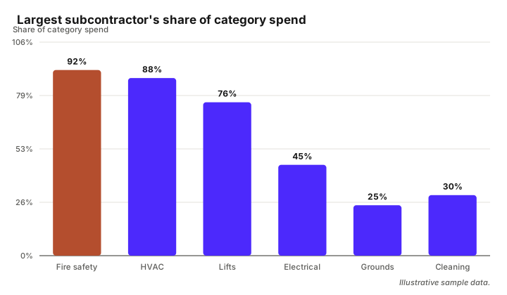
The value. A risk chart procurement can act on. A category where one specialist holds 90% of the work across every site is a resilience question before it is a price question, and it sets the sourcing plan: a second supplier at renewal, a regional split, or a deliberate decision to accept the concentration with a named contingency.
Where it misleads. Concentration measured on first-tier names misses subcontracting entirely, which in hard services is exactly the exposure you are looking for. It also over-reads deliberate concentration: a statutory inspection category held by one accredited provider is not a finding. And it collapses without supplier normalisation — one specialist under two spellings looks like two sources, and the risk vanishes from the chart.
The data it needs. Normalised supplier names with group-parent relationships, plus subcontractor identity on the line, which usually means self-delivery-versus-subcontract reporting from the supplier rather than anything in the ledger. Category at class level, contract end dates so exposure reads against renewal timing, and an accreditation flag to separate deliberate single-sourcing from drift.
8. On-contract versus off-contract (maverick) spend
What it answers. How much spend went through the arrangements already negotiated.
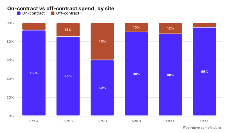
The value. Off-contract spend is the cheapest saving available, because the price was agreed and simply not used. Broken out by site, the chart names where the leakage is and usually why: a site with no contract coverage, a category where the framework does not include what people actually need, or a supplier used out of habit.
Where it misleads. It measures contract-register quality as much as behaviour. Emergency and out-of-hours work legitimately goes off-contract and should be separated rather than counted as non-compliance. Categories with no contract in place at all belong in their own band, or the chart blames sites for a gap that belongs to procurement.
The data it needs. A current contract register with supplier, category scope, site scope and validity dates, joined to spend on all four. Normalised supplier names again, a purchase-order reference, and an emergency flag. Where a contract covers only part of a category, its scope has to be recorded at the same classification depth as the spend, or the match fails in both directions.
9. Category spend trend against a materials or labour index
What it answers. Whether a category is getting more expensive faster than the market, or we are simply buying more of it.
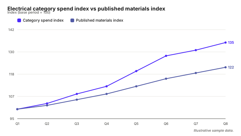
The value. This is the chart that settles a supplier's inflation case. When an uplift is requested citing material costs, a category indexed against a published materials or labour index shows whether their increases tracked, led or lagged it — a different negotiation from one conducted on assertion.
Where it misleads. The comparison breaks if the category mix shifted underneath it. If electrical quietly moved from consumables toward switchgear replacement, the line rises for reasons that have nothing to do with price, and the supplier will say so. Price has to be separated from volume first, which means a stable like-for-like basket rather than the category total. And never plot the two on two y-axes — index both to 100 at the same base period and read them on one scale.
The data it needs. A consistent category definition across the whole period, which means classification applied retrospectively to old lines, not only new ones. A like-for-like basket of commodity-level items with quantities. Net values excluding VAT, with surcharges treated the same way in every period — a fuel surcharge that starts being billed separately mid-series creates a fall that is not real. And a published index at the right granularity, on a stated base period — a general construction index against a labour-dominated services category compares the wrong thing.
What has to be true before any of this goes in front of a stakeholder
The sequence matters more than the chart library. Suppliers normalised and grouped, because half of these charts are wrong rather than imprecise without it — supplier matching is usually the real bottleneck in a spend cleanup, and it stops being a spreadsheet job at ledger scale. Spend classified deep enough for the specific chart: family or class level for the Paretos and the trends, commodity level plus a part number for anything comparing prices — the four UNSPSC levels are not interchangeable, and a chart built at the wrong depth looks fine and says nothing. And site and cost-centre identifiers that reconcile across finance, CAFM and the property record, which is the join that most often fails quietly.
That is what the spend cube framework is for: supplier, category and time as the three dimensions every chart above slices. Pearstop classifies spend lines to the depth each of these charts needs and returns a confidence level with every line, which is the practical test for whether a chart is safe to show — high-confidence lines are the ones you can base a negotiation on, and the low-confidence ones tell you where to look before the meeting. If you are still choosing how to get there, we have compared the available classification tools.
Questions fréquentes
How do you do a Pareto analysis of procurement spend?
Aggregate spend by supplier or by category over a fixed twelve-month period, sort descending, and read the cumulative percentage alongside the values to see how many entries reach 80%. It is only valid once supplier names have been normalised and grouped; otherwise a supplier split across several records sits lower in the ranking than it belongs.
What charts belong in a spend analysis?
At minimum, a Pareto by supplier and one by category, a tail-spend count, an on-contract versus off-contract split, and spend over time. For hard services, add planned versus reactive spend, a labour-versus-materials split, and price variance for the same task across sites, since those are the ones that produce an action rather than a description.
What data do you need for a spend cube?
Supplier, category and time as the three dimensions, net spend as the measure. In practice: normalised supplier names with parent-child grouping, every line classified to a consistent taxonomy at family level or deeper, and one consistent date basis. Site or cost centre is a valuable fourth dimension for facilities spend, and needs identifiers that reconcile across systems.
How do you compare prices across sites?
Match on the item or task rather than the description text, using commodity-level classification plus a manufacturer part number or normalised item identifier, and convert every unit of measure to one base unit. Separate unit price from quantity, hold the specification constant, and keep out-of-hours and emergency rates in their own comparison.

Stephanie Wiechers
CEO & Co-founder, Pearstop
Stephanie leads Pearstop's go-to-market and strategic direction. She works directly with procurement and FM leaders across Europe to understand how data quality affects margins, contracts, and AI readiness.
LinkedIn →Further reading
You've classified your spend. Now what?
Charge lines like freight and fuel surcharges don't fit a product taxonomy, but dropping or misclassifying them quietly breaks your spend category totals.
Read more →ProcurementHow to Implement UNSPSC Classification in SAP
A practical guide to automating UNSPSC coding in SAP-based procurement environments — what works, what does not, and how to get from messy spend data to a clean category baseline.
Read more →